Most product teams don’t fail because their idea is bad. They fail because they measure the wrong things, or measure them too late. In 2026 planning, churn and retention show up fast in the revenue math, and one 2026 benchmark report pegs median net revenue retention near 101% (meaning growth is often barely offset by losses). When that happens, product performance metrics stop being “nice dashboards” and start being the steering wheel.
Good measurement helps you spot wins early, fix weak spots without guessing, and scale what actually keeps users around. It also keeps teams honest about tradeoffs. Are you growing because the product improved, or because you spent more?
In this guide, you’ll learn how companies track KPIs for products across engagement, acquisition, retention (including churn), revenue, customer happiness, and development efficiency. Then you’ll see simple formulas, practical interpretation tips, and the tools teams use in 2026. You’ll also get common traps to avoid, plus a couple of real-style examples you can copy.
Key Metrics Companies Use to Track Product Success
Teams usually group product success metrics into a few buckets. Think of it like a car dashboard: one light tells you fuel is low, another shows speed, and another warns you about the engine. If you only watch speed, you still won’t know why the car stutters.
A strong starting point is comparing your metrics to published benchmarks. For example, Product Metrics Benchmarks (2026) groups reference points across engagement, activation, adoption, and satisfaction. That makes it easier to tell “we’re close” from “we’re off track.”
Here’s a simple view of the main KPI categories:
| KPI category | Common metric examples | What it signals |
|---|---|---|
| Engagement | DAU, MAU, feature usage | User value and stickiness |
| Acquisition and retention | CAC, churn, retention rate | Growth quality and stability |
| Revenue and lifetime value | ARPU, MRR, CLV | Business health over time |
| Satisfaction | NPS, CSAT | Likelihood users recommend and return |
| Development efficiency | cycle time, release frequency, defects | Delivery speed and product quality |
Next, let’s break down the metrics that show up most often.
Engagement Metrics Like DAU and MAU
Engagement metrics answer a simple question: Are people getting value often enough to come back? That’s why Daily Active Users (DAU) and Monthly Active Users (MAU) stay on so many dashboards.
- DAU is the count of unique users who do something meaningful each day.
- MAU is the same idea, but measured across a month.
You can also track session length and feature adoption to go beyond logins. DAU that rises with weak feature usage can look like activity, not value.
A useful pattern is to watch trends by cohort. If new users’ DAU climbs in week one, but drops in week four, you’ve likely found a “first win” but not the habit that keeps people coming back.
Here’s the key formula conceptually:
- DAU = unique active users per day Then you compare DAU to MAU. If MAU rises but DAU stays flat, people visit, but they don’t stick.
Acquisition and Retention Rates
Acquisition and retention rates tell you whether growth is durable.
Start with CAC (Customer Acquisition Cost):
- CAC = marketing and sales spend / new customers
Then pair it with retention.
Two core retention views are:
- Churn rate: how many customers leave
- Retention rate: how many stay
A common churn formula:
- churn rate = (lost customers / total customers at start) × 100
Companies watch churn because it hits revenue quickly. Also, high CAC with weak retention is a slow-motion problem. You might sign customers, but you can’t keep them.
Cohorts help here. Group users by signup date, then track churn and retention for each group over time. That’s how you see whether onboarding improvements actually work.
Revenue and Lifetime Value Indicators
Revenue KPIs connect product choices to business outcomes.
Common indicators include:
- ARPU (Average Revenue Per User)
- MRR (Monthly Recurring Revenue)
- CLV (Customer Lifetime Value)
To make ARPU clear:
- ARPU = revenue / active users
MRR is usually tracked from subscriptions, then broken down by new, expansion, and churn.
CLV takes longer. It estimates the total value a customer brings over the full relationship, usually after churn and payment changes.
The “golden check” many teams use is: high CLV vs. manageable CAC. If CLV doesn’t cover acquisition costs, product growth can’t last. You can keep scaling marketing, but margin will drain.
Also, try not to rely on vanity metrics. A big user count with low ARPU often means pricing or value delivery needs work.
Customer Happiness Scores
Customer happiness signals whether your product solves real problems.
Two popular metrics:
- NPS (Net Promoter Score)
- CSAT (Customer Satisfaction)
NPS is based on a survey question like “How likely are you to recommend?” Companies calculate it as:
- NPS = %promoters − %detractors
Promoters are usually respondents scoring 9 or 10. Detractors are 0 to 6.
CSAT is simpler. It’s often the average score from a post-use or post-support survey.
If NPS is low, it helps you choose feature priorities. For benchmarks and typical score ranges, see SaaS NPS Benchmarks 2026.
One gotcha: survey data can lie if you ask only happy users. That’s why response rate matters too. Track it alongside NPS.
Development Speed and Quality Measures
A product can have great engagement metrics and still lose long-term ground if teams can’t ship well.
So companies also measure delivery efficiency and quality:
- Time to market (from idea to launch)
- Cycle time (from start to deployed work)
- Release frequency
- Defect rates (bugs, incidents, and rework)
These metrics matter because slow delivery forces teams to compromise. It also increases the gap between user needs and what ships.
In 2026, many teams aim for faster cycles without “breaking the build.” That means measuring quality alongside speed. If release frequency rises and defect rates jump too, you might trade stability for momentum.
Simple Ways to Calculate and Interpret These Metrics
Calculations are the easy part. Interpretation is where teams mess up.
A good rule: compare metrics over time, then compare segments. One number alone rarely tells the truth.
Also, don’t let dashboards turn into a scoreboard for activity. Measurement should answer whether the product is getting better for users and healthier for the business.
The fastest teams don’t just ship more. They ship what improves the metrics that matter.
Mastering DAU, MAU, and Churn Calculations
Let’s make the math practical with real numbers.
DAU example:
If you have 240 unique active users on Tuesday, then:
- DAU = 240 for that day
To interpret it, look at the shape:
- If DAU grows week over week, engagement likely improves.
- If DAU drops after a release, investigate what changed.
You can also compute DAU trend rate:
- DAU change % = (new DAU − old DAU) / old DAU × 100
Now churn.
Churn example:
You start the month with 200 customers. You lose 10.
- churn rate = (10 / 200) × 100 = 5%
If churn is climbing, retention experiments should move up the priority list. If churn stays flat while engagement drops, users may still renew out of habit, not value. That’s a risk too.
Many teams watch a rough benchmark for SaaS churn, where monthly churn under 5% is often treated as a healthy target (varies by segment, pricing model, and contract length). For segment-specific reference points, compare against published benchmarks like SaaS churn benchmarks in 2026.
Finally, pair churn with retention rate:
- retention rate = 100% − churn rate (for a simple customer count view)
NPS and CAC: Numbers That Guide Decisions
Here are two metrics that often drive high-quality decisions because they link sentiment and profitability.
NPS calculation:
If 40% are promoters and 15% are detractors:
- NPS = 40% − 15% = 25
Interpretation depends on your baseline. Many teams aim for above 50 in strong loyalty segments, but the key is improving over time for your user group.
Now CAC, which must include total acquisition costs. If you only count ad spend, you’ll underestimate reality.
CAC example:
Your team spends $60,000 on sales and marketing in a month. You gain 600 new customers.
- CAC = 60,000 / 600 = $100
To avoid a trap, don’t stop at CAC. Pair it with value.
You can use:
- ARPU = revenue / active users or
- CLV if you have a retention model
Quick profitability check:
If CAC keeps rising but ARPU and CLV don’t, you’re buying customers you can’t keep. That usually means onboarding, product value, or pricing needs attention.
If your churn stays high, CAC cuts won’t save the business. Retention saves it.
Best Tools and Frameworks for Real-Time Tracking
Measuring product performance is harder when data lives in five places. It’s also harder when reports arrive a week late.
That’s why teams in 2026 focus on two things:
- A unified dashboard that shows product, sales, and support signals.
- Faster updates, sometimes near real time.
When you can see trends quickly, you can run experiments sooner. You can also spot breakpoints after releases.
Dashboard Tools That Unite Your Data
Dashboards should do one job well: show the right KPIs in one view, with drill-down options.
Common tool patterns:
- monday.com style boards for alerts and status views
- Airtable for flexible KPI tables and custom calculations
- Atlassian tooling for tracking work-to-impact links
If you want a practical guide to building dashboards, see Product management dashboard: complete guide for 2026.
A good dashboard setup supports three behaviors:
- Track the KPI over time
- Diagnose by segment (new vs existing users, plan tier, channel)
- Decide what to change next
Also, use goal-based buckets instead of a giant list:
- business goals (revenue, churn, expansion)
- user goals (activation, feature adoption)
- ops goals (cycle time, defects)
Finally, keep your dashboard aligned to outcomes. If the dashboard doesn’t change decisions, it’s noise.
AI Trends Revolutionizing Measurement in 2026
AI isn’t just for faster reporting. It’s getting used for prediction and anomaly detection.
Here’s what teams use AI for in product measurement:
- forecasting churn risk using behavior patterns
- spotting “metric dips” after releases
- turning support tickets and feedback into themes
- predicting which features drive retention
The big shift is from “Did we ship?” to “Did we reduce risk or raise value?”
Also, be careful with AI shortcuts. A model can predict churn, but it still needs a human-driven follow-up test. If you don’t run experiments, prediction turns into a new form of guesswork.
Challenges Companies Face and Smart Fixes
Even strong teams hit measurement problems. Most issues come from three causes: wrong math, wrong focus, or split data.
Avoiding Data Silos and Metric Overload
Data silos kill clarity. Sales tracks conversion. Product tracks usage. Support tracks tickets. Then nobody agrees on which number “wins.”
A fix is shared ownership. Put the KPI definitions in one place. Then build one dashboard that both teams can trust.
Metric overload is the other common issue. Teams add KPIs until no one knows what to act on.
A simple strategy:
- pick 5 to 10 core KPIs aligned to goals
- add deeper metrics only in drill-down views
- review the core set weekly, not monthly
For example, a company might track 25 metrics in tools. But the weekly executive view should show 7 core metrics. That keeps meetings focused.
Spotting Risks Early with Better Methods
Late risk spotting is expensive. You ship a change, then you find out a month later that churn jumped.
To avoid that, move from static reports to faster signals:
- watch DAU and activation in near real time
- monitor churn cohorts early, not just end-of-month totals
- track support trends (a rise in certain issues can predict churn)
- compare release notes to metric shifts
If you only check metrics after the month ends, you’ll miss the best chance to correct course.
Use AI alerts for anomaly detection, then verify with human analysis. When something changes, ask: what did users start doing differently?
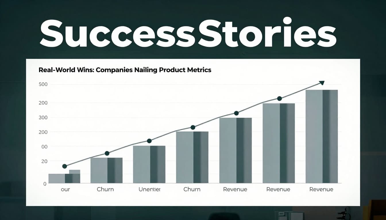
Real-World Wins: Companies Nailing Product Metrics
Great measurement looks boring from the outside. It just works.
Most wins share the same pattern:
- track the right metric,
- link it to a user problem,
- run a focused change,
- measure results in the next cycle.
Turning High Churn into Loyal Users
Imagine a SaaS team with a stable sales pipeline, but churn near the wrong side of their target range. Their dashboard showed churn rising in a specific cohort: customers who didn’t reach the “first value” step in week one.
So they changed onboarding. They added clearer setup steps and triggered an in-app guide when users hit the usual stuck point.
After one or two cycles, they measured:
- lower early churn for the new cohort
- higher feature adoption in week two
- improved ARPU (because more users upgraded)
Because they tracked churn cohorts, they avoided the trap of declaring victory based on DAU alone.
How NPS Shaped Hit Features
Another team used NPS to decide what to fix first. Their NPS comments kept pointing to the same issue, but their roadmap didn’t match the complaint theme.
Once they tagged feedback by feature, they saw the relationship between low NPS and a specific workflow. That feature also had high support ticket volume.
They prioritized fixes there, then watched:
- NPS improvement in the next survey window
- CSAT changes after support interactions
- reduced tickets for the same problem
When NPS rose, loyalty improved. Users came back more often. That boosted engagement and supported retention.
Those are the kinds of “measurement-to-action” loops product leaders want.
Conclusion
When companies measure product performance, they’re doing more than tracking numbers. They’re protecting revenue, reducing risk, and improving user value.
You now have a practical set of product performance metrics to start with: engagement (DAU/MAU), retention (churn), revenue (ARPU/MRR/CLV), satisfaction (NPS/CSAT), and efficiency (cycle time and defects). You also saw how to calculate key KPIs and interpret them with cohorts and trends.
Pick three KPIs you’ll own this month. Build a shared dashboard, then review weekly. If you do that, you’ll spot issues early, and your product roadmap will stop guessing.