Ever wonder how one bad batch can trigger a recall, even when everyone “did their job”? Quality problems often start small, then spread through a process before anyone spots the pattern.
Quality control is how industries catch those issues early. It means checking both products and processes, then using the evidence to fix the cause, not just the symptom. The right quality control tools save time, cut waste, and keep customers confident in what you ship.
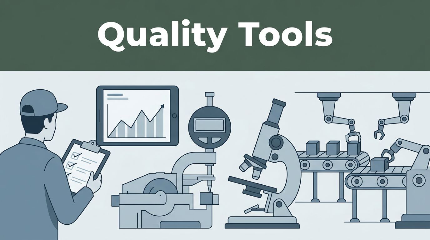
In the sections below, you’ll see the tools teams use every day, from simple paper charts to software that links audits, testing, and corrective actions. You’ll also get real examples across manufacturing, pharma, food, and electronics, plus what’s changing in 2026 as AI and eQMS adoption grow.
Curious which tools top teams swear by?
Simple Manual Tools That Catch Issues Before They Grow
Not every quality problem needs a big budget. Some of the most effective quality control tools are simple, visual, and fast to use.
These “basic” methods are popular for a reason. They help people agree on what’s happening, where it’s happening, and why it’s happening. If you’re training a new inspector or improving a line after a spike in defects, these tools make progress easier.
For a refresher on the classic set of methods, see Seven Basic Quality Tools to Keep in Your Back Pocket. You’ll recognize the same tools you’ll use in your own shop or lab.

A quick note on “manual” in 2026
Manual tools still work in 2026 because they’re perfect for early detection and team alignment. Plus, when tech fails, you still have the basics.
Fishbone Diagrams and Pareto Charts: Pinpoint Top Problems
When defects rise, people often guess. A fishbone diagram helps you stop guessing. It shows possible causes by category, so the team can narrow down what’s driving the issue.
A Pareto chart then tells you which causes matter most. In many cases, most defects come from a small set of drivers. That’s the classic 80/20 idea, and Pareto charts make it visible.
Many teams learn these tools as part of the “7 QC tools” tradition. If you want background, The 7 Quality Control Tools: A Comprehensive Guide is a solid starting point.
Fishbone diagram example (manufacturing)
Imagine an auto plant starts seeing more scratches on a metal panel. A fishbone diagram might split causes into:
- Machine (worn rollers, misaligned guides)
- Method (wrong handling steps, rushed loading)
- Materials (rough incoming sheet, bad protective film)
- Measurement (inconsistent visual checks, changing criteria)
- People (new shift operator, different grip technique)
- Environment (dust, vibration from nearby equipment)
Next, the team gathers quick evidence. Maybe scratch depth stays consistent, which points to a specific surface contact point. Or perhaps scratches cluster during one shift, which points to method or training.
Pareto chart example (food)
Now think about contaminated food complaints. You might list defect types like:
- Wrong temperature
- Missing label
- Seal failure
- Cross-contact
- Off-odor
Then, you count occurrences for a set period. If seal failure and temperature make up most reports, you focus fixes there first. That approach saves time when you can’t fix everything at once.
How to use both tools fast
- Pick one clear problem statement (example: “Scratches on panel finish”).
- Build fishbone causes with a small group.
- Collect counts for each cause or defect type.
- Plot Pareto and highlight the top drivers.
- Assign fixes to the top causes first.
These tools help because they create focus. Instead of arguing about blame, teams discuss evidence.
Control Charts and Histograms: Track Stability and Variation
Some defects happen by chance. Others signal a process that drifted out of control. Control charts help you tell the difference.
A control chart tracks data over time with limits. If the process stays within limits, variation is “normal.” If points jump outside limits, or trends form, something changed.
Histograms then show the shape of the data. They help you see spread, skew, and outliers in a way a raw table can’t.
Control chart example (pharma)
In a pharma plant, you might track pill tablet weight. A common chart is an X-bar chart for averages, plus a range chart for spread. If the points drift, it can signal a mixing change or feeder problem.
If the process stays stable, you can focus on other quality risks. If it’s unstable, you investigate before releasing more product.
Control chart for defects (general)
For defect rates, many teams use a p-chart or similar chart. Example: track the share of units that fail visual inspection each shift. If the failure rate spikes, you know sampling alone won’t explain it.
Histogram example (metal lengths in factories)
Suppose a machine produces brackets with a target length. You collect measurements and plot a histogram. If most parts cluster tightly, your process is consistent. If the histogram spreads out, you may need tool calibration, a new offset, or tighter process settings.
Scatter diagram tip (electronics)
A scatter plot can pair well with control charts. For example, plot test speed (x-axis) against error rate (y-axis). If faster testing increases failures, you can set a speed limit or improve the test fixture.
How to read them quickly
- Look for trends over time, not one-off blips.
- Check variation, especially if it widens suddenly.
- Use control chart signals to decide when to stop and investigate.
- Use histograms to understand whether the data fits what you expect.
For many teams, these tools turn quality work into a habit, not an emergency.
Check Sheets and Flowcharts: Everyday Data Collection
Quality improvements often fail because teams can’t gather consistent data. A check sheet solves that by making counting simple and repeatable.
A flowchart then helps you map the process. It shows each step and where checks belong. When defects appear, you can trace back through the map and spot weak steps.
Check sheet example (scratches on parts)
You can design a check sheet for scratches in minutes. It might include:
- Part ID or lot number
- Location of scratch (corner, edge, center)
- Scratch type (light, deep, scuffed)
- Inspection station
- Shift and date
Then inspectors mark each unit. Over time, you’ll see patterns, like scratches happening more often at one station or during a specific shift.
Flowchart example (drug making)
In pharma, flowcharts help with process clarity. A flowchart might show steps like:
- Raw material receipt
- Weighing and mixing
- Filtration
- Filling
- Labeling
- Packaging
- Storage and release
If batch records show higher rejection rates, the flowchart helps you find which step aligns with the change. It also helps newer staff understand where quality checks fit.
Mobile apps, but the same idea
Flowcharts and check sheets can live on paper or phones. Many teams now use mobile apps to capture timestamps, photos, and lot IDs. Even with software, the goal stays the same: consistent data, captured quickly.
If you’re teaching this to a new team, start with paper. You’ll spot confusion fast. Then move to an app once the process is stable.
Automated Software and Hardware Revolutionizing Quality Checks
Manual tools are great for early signals. But at scale, you need automation.
That’s where eQMS platforms and quality software come in. They manage documents, track nonconformities, run audits, and connect fixes to evidence. Many teams also add hardware for fast inspection at line speed.
In 2026, cloud eQMS use keeps rising. Realtime reporting shows over 70% of industries now use cloud-based eQMS for tracking and compliance.
What automation changes
Automated tools help because they:
- Reduce missed handoffs
- Keep records in one place
- Standardize audits and CAPA workflows
- Support trend reports across lots and suppliers
They also speed up decisions. Instead of waiting weeks for a summary, teams can see patterns as they form.
Leading Software Platforms for Full QC Management
When people search for the best options, they often look for one thing: fewer scattered systems. The best platforms connect quality data to actions.
For a broader buyer view, see Top 10 QMS Systems for 2026: A Buyers Guide. It’s helpful for understanding what “quality management system” coverage can include.
Here’s a quick comparison snapshot to help you think through choices. For deeper, side-by-side market comparisons, 17 Best Quality Management Software – 2026 Reviews & Pricing can help you narrow candidates.
| Platform | Best fit in plain terms | Common QC strengths |
|---|---|---|
| QT9 QMS | Regulated teams that want audit and CAPA flow | CAPA tracking, audit support, training and document control |
| MasterControl | Firms that want compliance workflows built in | Training links, document control, regulated processes |
| SafetyCulture (iAuditor) | Teams that want mobile audits and photos | Fast on-site inspections, clear evidence trails |
| Fabrico | Teams with machine-linked quality actions | Vision-linked checks and quick process fixes |
How teams use these tools day to day
In a typical workflow, software handles the boring parts so humans can focus on analysis:
- Capture an issue (nonconformity)
- Assign owners and due dates
- Store evidence (photos, lab results, records)
- Track CAPA (corrective and preventive action)
- Verify effectiveness, then close
That “verify effectiveness” step matters. Many quality programs fail when fixes don’t prove they worked.
2026 add-on: smarter analytics
Even when you keep the workflow simple, many platforms now add trend insights. AI can spot risk patterns from past batches, and help teams prioritize what to inspect next. That shifts quality work from reactive to guided.
Vision Systems, Sensors, and Calibrators in Action
Software keeps records tidy. Hardware makes inspection faster and more consistent.
Computer vision systems can scan parts for cracks, dents, scratches, and missing labels. They work at speed, and they don’t tire like people. Many modern setups use AI to improve defect detection over time.
Sensors do similar work in the background. They measure temperature, vibration, pressure, humidity, and more. Then systems flag values that drift outside the expected range.
Calibrators matter too. If scales and gauges drift, everything you measure becomes less trustworthy. Calibration checks keep data meaningful, especially in pharma and food.
Example: electronics on a busy line
In electronics, a camera can inspect tiny solder joints or pinhole defects. Then operators review only the flagged units. Over time, teams connect inspection results to process settings, so they can adjust solder temperature or reflow timing sooner.
Example: food and pharma scale checks
In food packaging, a mismatch in weight can signal a filling problem. Calibrators help catch that early. Then check sheets and control charts keep track of whether the correction stuck.
For industries that run nonstop, these hardware tools act like “continuous eyes.” They also reduce the chance of releasing a bad batch.
How Top Industries Put These Tools to Work Daily
Quality control isn’t one-size-fits-all. Still, the pattern stays the same: teams collect data, spot the biggest causes, track stability, then fix root issues.
What differs is the defect type, the tolerance, and how strict the documentation must be.
Automotive and Manufacturing: From Assembly Lines to Fixes
In automotive, defects often come from equipment wear and handling changes. Teams commonly start with Pareto charts after a surge in rework. Then they use fishbone diagrams to trace likely causes.
Once they know what’s driving scrap, automated inspection helps them react faster. Machine-linked quality tools can connect vision checks to specific production settings.
A practical flow might look like this:
- Pareto chart shows 3 defect types dominating scrap.
- Fishbone diagram points to one machine station and handling method.
- Control chart confirms the process drifted after a setup change.
- Vision hardware spots defects as parts move.
- CAPA workflow records the fix and verifies results.
The result is fewer escapes and faster corrections. Instead of waiting for end-of-line results, teams catch issues earlier.
Pharma and Food: Strict Standards Met with Smart Checks
In pharma, quality isn’t just inspection. It’s compliance plus control of how batches are made.
Teams often use control charts for process stability and check sheets for batch-level defect tracking. They also rely on CAPA workflows in eQMS to manage investigations. When deviations happen, teams document evidence, assign root causes, and verify that the fix works on later batches.
In food, contamination risks can spike if handling steps change. Check sheets can capture where contamination signals happen (line zone, shift, supplier lot). Flowcharts also help map food safety steps, from receiving to storage to packaging.
Many teams add mobile audits, because photos and timestamps make it easier to prove what changed and when.
Electronics: Precision for Tiny Components
Electronics quality often runs on measurement and detection. Small shifts can cause bigger problems downstream.
Histograms show variation in dimensions like part length and thickness. Control charts track stability in critical measurements. Scatter plots help teams find links between test conditions and failure rates.
Then vision systems can catch surface defects quickly. In practice, teams often combine vision scans with software records. That way, they don’t just flag defects, they also link them to lot data and process settings.
When you connect inspection to the “why,” quality stops being a mystery.
2026 Trends Making Quality Control Smarter and Faster
Quality control in 2026 is moving from “catch defects” to “predict risk.” That means better use of AI, faster inspections, and more connected systems.
Realtime reporting highlights major shifts:
- AI for predictive maintenance and earlier issue detection
- More defect reduction through better real-time analysis
- Higher adoption of cloud eQMS across industries
Computer vision is also expanding beyond simple checks. Systems increasingly spot patterns that a human might miss during long shifts. Meanwhile, agentic AI workflows can help teams route issues and suggest next investigation steps.
If you want more industry context on where quality control is heading, this guide is a good read: Quality Control in 2026: From Inspection to Prediction.
A simple way to think about the change
Instead of waiting for defects to show up at the end, you:
- Monitor stability with control charts
- Use histograms and scatter plots to understand variation
- Inspect quickly with vision systems
- Manage investigations with eQMS and CAPA
- Use AI to spot patterns earlier
Some teams report large defect drops when AI improves how they respond. In smart factories, reductions of up to 50% have been reported for post-release fixes, depending on the setup and maturity.
The point isn’t to chase hype. The point is to build a system that learns.
Conclusion
Quality control tools start with clarity. Manual methods like fishbone diagrams, Pareto charts, control charts, check sheets, and flowcharts help teams spot causes and track stability.
From there, automation takes over the heavy lifting. eQMS platforms connect audits, CAPA, and verification. Vision systems and sensors make inspection faster and more consistent.
If you’re trying to improve quality this year, start small. Pick one process, track the data, and fix the top causes. Then scale to software and smarter inspection when you see real gains.
What would happen if your team could catch the next issue before it ever reached a customer?